Visualization Element: Frame
Symbol:

Category: Basic
The element serves as a frame in which to display one or more already existing visualizations. You get a structured user interface. The size of the frame can be fixed or scaled. The display area of the referenced visualization then adapts itself to the frame size.

Element properties
Are all element properties available?
All properties are available only after you select the Advanced option or the All categories filter in Properties.
Element name | Example: Name assignmentAssign individual names for elements so that they are found faster in the element list. |
Element Type | Frame |
Clipping |
Requirement: The Scaling type property is Fixed. |
Show frame | . Displays the frame
|

Are all element properties available?
All properties are available only after you select the Advanced option or the All categories filter in Properties.
Name assignment
Assign individual names for elements so that they are found faster in the element list.
Scaling type
Scaling type | Defines the scaling of the height and width of the referenced visualization The visualization is displayed in either a frame or a tab element. |
Isotropic | The visualization is scaled to the size of the element to be displayed. With a fixed height-to-width ratio, the visualization retains its proportions. |
Anisotropic | The visualization is scaled to the size of the element to be displayed. The height and width are each individually scaled to the element. |
Fixed | The visualization is displayed in its original size, regardless of the dimensions of the element to be displayed. |
Scroll Bar | The visualization is displayed in the element without any scaling. If it is larger than the element, then the element is provided with a scroll bar. Note: Assign variables to the properties Scrollposition variable horizontal or Scrollposition variable vertical. You can process the data for the scroll bar position in the application. |
Dynamic scrollable | The size of the visualization is calculated dynamically and cyclically. When the size is calculated, the visibility of the elements of the referenced visualization is taken into account. The scroll bars are displayed only in case the contents of the referenced visualization cannot be fully displayed in the frame area after the dynamic calculation. |
Deactivation of the background drawing
Deactivation of the background drawing |
The advantage is that background elements, such as colored rectangles, are drawn once in the background.
It can become problematic if another element (of the main page) is supposed to run behind this background frame. In this rare case, it makes sense to set this option so that the rectangle actually runs behind it. NoteThe property is available for the following settings:
|

Swiping
With this feature, the visualizations referenced in the element (Frame or Tabs) can be toggled by means of a swipe gesture (pan or flick gesture).
Swiping behavior | Requirement: Swiping is possible only when the Multitouch handling option is selected. Options for how a visualization user needs to perform the swipe (pan or flick gesture) to trigger an image change to the next referenced visualization in the element:
Hint: Set the scaling type to Anisotropic. |
Swiping preview | Requirement: The option is available only in overlay mode (Support client animations and overlay of native elements option) to display the preview images on multitouch devices.
|

For more information, see: Referencing of Visualizations or Settings
References
Contains the currently configured visualization references as a subnode
Configure Button | Opens the Frame Configuration dialog. The dialog allows you to manage the referenced visualizations. |
References | WarningVisualizations can be nested at any depth by means of Frame elements. In order to use the Switch to any visualization frame selection type without any problems, a frame must not contain more than 21 referenced visualizations. For more information, see also the description for the Input configuration of an element: Action Switch frame visualization. |
List of the currently referenced visualizations | Visualizations that have a button also have this displayed as a subnode. Each interface variable is listed with the currently assigned transfer parameters. Example: . vis_FormA
TipYou can change the assignment of the variables to an interface variable here and edit the value field. Or click the Configure button instead. |
Position
The position defines the location and size of the element in the visualization window. This is based on the Cartesian coordinate system. The origin is located in the upper left corner of the window. The positive horizontal X-axis runs to the right. The positive vertical Y-axis runs downwards.
X | The X-coordinate (in pixels) of the upper left corner of the element Example: |
Y | The Y-coordinate (in pixels) of the upper left corner of the element Example: |
Width | Specified in pixels Example: |
Height | Specified in pixels Example: |
Tip
You can change the values by dragging the box  symbols to other positions in the editor.
Center
The properties contain fixed values for the coordinates of the point of rotation. The rotation point is displayed in the editor as the  symbol and is used as the center for rotation and scaling.
Tip
You can also change the values by dragging the symbol to another position in the editor.
X | Editable X-coordinate of the point of rotation Double-clicking in the value field will open the line editor. |
Y | Editable Y-coordinate of the point of rotation Double-clicking in the value field will open the line editor. |
Colors
The properties contain fixed values for the text colors.
Color | Color of the frame
NoteNormal state is when the Boolean variable in the Color variables element property is not defined or its value is |
Alarm color | Color for the element in alarm state NoteAlarm condition is when the value of the Boolean variable in the Color variables → Toggle color element property is |
Transparency | Integer (value range from
Read-only transparencyThe property is read-only when the color is a style color with a predefined transparency value. |


Appearance
The properties contain fixed values for setting the look of the element.
Line width | Value (in pixels) Example: NoteThe values |
Line style | Type of line representation
|
Tip
You can assign variables in the Appearance variables property for controlling the appearance dynamically. The fixed values are defined here.
Texts
Text | String (without single straight quotation marks) Example: The element is labeled with this text. If a placeholder |
Tip
Use the Ctrl + Enter shortcut to add a line break.
Tip
The specified texts are automatically transferred to the GlobalTextList text list. Therefore, these texts can be localized.
Text properties
The properties get fixed values for the text properties and act on the texts configured in or .
Horizontal alignment | Horizontal alignment of the text within the element |
Vertical alignment | Vertical alignment of the text within the element |
Text format | . Definition for displaying texts that are too long
|
Font | Example: Default
|
Font color | Example: Black
|
Transparency | Integer (value range from The transparent value determines the transparency of the respective color.
Read-only transparencyThe property is read-only when the color is a style color with a predefined transparency value. |
Absolute movement
The properties can be assigned to IEC variables for controlling the position of the element dynamically. The reference point is the upper left corner of the element. At runtime, the entire element is moved.
Movement | ||
X |
Increasing this value at runtime moves the element to the right. | |
Y |
Increasing this value at runtime moves the element downwards. | |
Rotation | Variable (numeric data type) for the angle of rotation (in degrees) Example: The midpoint of the element rotates at the Center point. This rotation point is shown as the At runtime, the alignment of the element remains the same with respect to the coordinate system of the visualization. Increasing the value rotates the element to the right. | 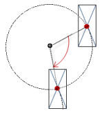 |
Interior rotation | Variable (numeric data type) for the angle of rotation (in degrees) Example: At runtime, the element rotates about the point of rotation specified in Center according to the value of the variable. In addition, the alignment of the element rotates according to the coordinate system of the visualization. Increasing the value in the code rotates clockwise. The rotation point is shown as the NoteIf a static angle of rotation is specified in the property, then the static angle of rotation is added to the variable angle of rotation (offset) when the visualization is executed. | 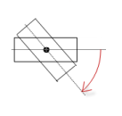 |
Tip
You can combine the variables to a Unit conversion.
Tip
The X, Y, Rotation, and Interior rotation properties are supported by the "Client Animation" functionality.
Relative movement
The properties contains variables for moving the element. The reference point is the position of the element (Position property). The shape of the element can change.
Movement top-left | |
X |
Incrementing the value moves the element to the right. |
Y |
Incrementing the value moves the element to the down. |
Movement bottom-right | |
X |
Incrementing the value moves the element to the right. |
Y |
Incrementing the value moves the element to the down. |
Text variables
Text variable | Variable (data type conforming to the formatting specification) for the placeholder in the Texts → Text property Example: The variable value replaces the placeholder in the text of the element. At runtime, the element is labeled with the text, and the variable value is constantly updated. NoteIf you specify a variable of type enumeration with text list support, then the name of the enumeration data type is added automatically in angle brackets after the variable name. Example: |
Tooltip variable | Variable (data type conforming to the formatting specification) for the placeholder in the Texts → Tooltip property Example: The variable value replaces the placeholder in the tooltip of the element. At runtime, the tooltip is displayed and the variable value is constantly updated. |
Dynamic texts
Dynamic texts are variably indexed texts of a text list. At runtime, the text is displayed that is currently indexed in the variable.
Text List | . Name of the text list
Note: If a text list from the project is transferred to a visualization in a library, then a dot has to be prepended to the name of the text list. |
Text index | . Text list ID which refers to the desired output text
|
Tooltip index | . Text list ID which refers to the desired output text
|
Font variables
The variables allow for dynamic control of the text display.
Font name | Variable ( Example: TipYou can find out which fonts are available in the standard Font dialog. |
Size | Variable (numeric data type) for the font size (in pixels or points) The applied unit is specified in brackets after the variable name.
TipThe font size is specified in points (example: Arial 12). Use points when the variable font size should match a font, for example if a font is set in the property. TipIf you click in the value field, a |
Flags | Variable ( . Flags:
NoteYou can combine the font displays by adding the coding of the flags. For example, a bold and underlined text: |
Font | Variable ( The selection of character set numbers corresponds to the Script setting of the standard Font dialog. |
Color | Variable ( Example: |
Flags for text alignment | Variable (integer data type) for coding the text alignment Example: . Coding:
NoteYou can combine the text alignments by adding the coding of the flags. For example, a vertical and horizontal centered text: |

Tip
Fixed values for displaying texts are set in Text properties.
Color variables
The Element property is used as an interface for project variables to dynamically control colors at runtime.
Toggle color | Variable ( . Value assignment:
. Assigning the property:
|
Color | Color variable for the frame
Requirement: Show frame property is activated. NoteThe normal state is in effect if the expression in the property is not defined or it has the value |
Alarm color | Color variable for the frame in alarm state
NoteThe alarm state is in effect if the expression in the property has the value |

Tip
The transparency part of the color value is evaluated only if the Visualization ManagerActivate semi-transparent drawing option of the visualization manager is selected.
Tip
In the toolbar of the Properties, select the Advanced option. Then all element properties are visible.
Look variables
The properties contain variables for controlling the appearance of the element dynamically.
Line width | Variable (integer data type) for the line width (in pixels) NoteThe values 0 and 1 both result in a line weight of one pixel. If no line should be displayed, then the Line style property has to be set to the Invisible option. |
Line style | Variable (DWORD) for the line type . Coding:
|
Tip
Fixed values can be set in the Appearance property. These values can be overwritten by dynamic variables at runtime.
Toggle variable
Variable | The variable controls the switching of the referenced visualizations: The variable indexes one of the referenced frame visualizations and this is displayed in the frame. When the value of the variable changes, it switches to the recently indexed visualization.
|
State variables
The variables control the element behavior dynamically.
Invisible | Variable (
|
Tip
The Invisible property is supported by the "Client Animation" functionality.
Animation
Tip
These properties are available only when you have selected the Support client animations and overlay of native elements option in the Visualization Manager.
Animation duration | Variable for the duration (in milliseconds) in which the element runs an animation
. Animatable properties
The animated movement is executed when at least one value of an animatable property has changed. The movement then executed is not jerky, but is smooth within the specified animation duration. The visualization element travels to the specified position while rotating dynamically. The transitions are smooth. |
Move to foreground | Variable (
Example: |
Input Configuration
The properties contain the configurations for the user input when using the mouse or keyboard. A user input defines an event and one or more actions that are executed when an event occurs.
TipThe Configure button opens the Input Configuration dialog. There you can create or edit user inputs. Configured user inputs are listed below the events. They each include the action that is triggered and the setting in short form. Example: Execute ST Code: | |
OnDialogClosed | Input event: The user closes the dialog. |
OnMouseClick | Input event: The user clicks the mouse button completely in the element area. The mouse button is clicked and released. |
OnMouseDown | Input event: The user clicks down on the mouse button. |
OnMouseEnter | Input event: The user drags the mouse pointer to the element. |
OnMouseLeave | Input event: The user drags the mouse pointer away from the element. |
OnMouseMove | Input event: The user moves the mouse pointer over the element area. |
OnMouseUp | . Input events:
NoteThis CODESYS-specific triggering behavior guarantees that actions for key elements are completed. A key element starts an action for OnMouseDown and ends the action for OnMouseUp. Example: A visualization user presses the mouse button within the element area of the key element and then moves the cursor position so that it is located outside of the element area. The action is ended anyway because OnMouseUp is triggered. |
OnValueChanged | Event which triggers follow-up actions due to a change in value Which follow-up actions are triggered is configured in the Input Configuration dialog. The defined follow-up actions and the corresponding configuration are displayed below the element property. The OnValueChanged event can be disabled by the VISU_NO_VALUECHANGED compiler define in the properties dialog of the application. |

Tap | When a mouse click event occurs, the variable defined in Variable is described in the application. The coding depends on the Tap FALSE and Tap on enter if captured options. |
Variable | Requirement: The Tap FALSE option is not activated. Variable (
Example: |
Tap FALSE |
|
Tap on enter if captured |
The value is |
Switch over | With the onset of a mouse click event, the variable is set; when the mouse click event is completed, the variable is reset. |
Variable | Variable ( This is when the user releases the mouse button while the mouse pointer is over the element area. If the user releases the mouse button while the mouse pointer is outside of the element area, then the mouse click event is not ended and the value is not toggled. TipThe user can cancel a started toggle input by dragging the mouse pointer out of the element area. |
Toggle on up if captured |
|
Hotkey | Shortcut on the element for triggering specific input actions When the hotkey event occurs, the input actions in the Events property are triggered. In this way, it is not the input action itself that leads to this input action, but the mouse input action. |
Key | Key pressed for input action. Example: T The following properties appear when a key is selected. |
Events |
|
Switch over |
Example: Shift+T. |
Control |
Example: Ctrl+T. |
Alt |
Example: Alt+T. |
Tip
All keyboard shortcuts and their actions that are configured in the visualization are listed on the Keyboard Configuration tab.
Permissions
Note
Available only when a user management is set up for visualization.
Access Rights button | Opens the Access Rights dialog. There you can edit the access privileges for the element. . Status messages:
|